

The element that most distinguishes a helicopter at first sight is its main rotor. It consists of of a hub and a certain number of blades and each time it starts spinning around its axis, the main rotor performs the magic of transforming a heavy fuselage into a flying machine with exceptional performance, generating lift, propulsion and flight control.
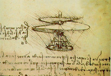
The helicopter rotor was not conceived and developed by a single person, its birth and evolution is the result of the ingenuity of exceptional minds, in the first half of the 20th century they transformed Leonardo da Vinci’s idea of vertical flight into reality.
When, for the first time, I studied the operation and design principles of helicopter rotors, I was fascinated by how many parameters are hidden behind a seemingly simple system and how they can be extensively ranged. For example:
- The greater is the diameter of a rotor, the better is the stability guaranteed to the helicopter, both in hovering and in translated flight. If small, the rotor will allow to reach high speeds and to have greater maneuverability.
- Many helicopters are equipped with only two blades, obtaining good aerodynamic performance, a simple construction and a small footprint. On the other hand, helicopters with many blades are able to take full advantage of engines power.
- A high speed of rotation of the rotor leads to a high maneuverability, just think of the radio-controlled helicopters that are able to perform all kinds of evolution thanks to the very high rotation of its dynamic groups.
The list could be much longer, including design parameters such as the position with respect to the fuselage, the chord of the blades, the materials used, the type of hub-blade joint. Choosing the right mix of parameters, the rotor is incredibly flexible and capable of adapting to multiple functions, even flying to Mars.

As I have done other times in my blog, moving my engineering education to the world of trading is a natural reaction. When I look at an investment or trading strategy, I can’t do without to focus my attention on the parameters and to think about how they can be modified to shape the strategy to my liking and to fir it to my investment targets. The number of assets, the weights, the timeframe, the parameters of the indicators, the percentages of stop loss, they are all ingredients of the same recipe.
In this article we are going to see how I designed my “Sector” trading system, trying to answer the many questions I received that ask what happens if we change its parameters. Although it is assembled with few simple rules, we are going to see that “Sectot” is capable of adapting, like a helicopter, to the mission it has to carry out.
Trading System “Sector”
Let’s quickly review the features and the rules of “Sector”, which were discussed in deeper detail in this dedicated article:
- the target is to outperform the MSCI World benchmark index
- the basket has only ETFs with underlying sectorial MSCI Worlds
- daily timeframe of historical series
- at the close of the last day of the month on the Italian Stock Exchange, the Percentage Price Oscillator (PPO) with 384 periods (equivalent to approximately 1.5 years) of each sector ETF is calculated.
- Only the ETF with the largest PPO is bought and kept in the portfolio.
- The ETF already present in the portfolio will be sold to make way for the new ETF.
These rules ensure that portfolio invests in the sector that has the highest strength, furthermore to maximize the potential return portfolio is always on the market even in times of high volatility, meanwhile the long period for PPO and the monthly timeframe reduces the number of operations to few trades a year. I point out that the time series used in this article are provided by Lyxor, these have a greater depth than the competitor and, important thing, they are quoted directly in euros, so that the results of our analysis do not have to take into account any currency changes.
And now, let’s move the sticks of “Sector” and observe how the response of our trading system changes!
PPO and Rotor Diameter
The question I often get from readers is how does “Sector” change if we take a different period for the PPO oscillator. First, remind that PPO(x) takes the following form:
PPO(x) = \frac{P_0 - EMA(x)}{EMA(x)}where EMA(x) is an exponential moving average, P0 is the daily closing price and x is the set of x closing prices prior to P0. It belongs to the class of momentum oscillators, capable of evaluating the trend, the strength and the speed of prices. From my point of view as an aeronautical engineer, choosing a value for x isn’t so different as to choose the diameter of a helicopter rotor:
- a small period x will give maneuverability to our trading system, it will be able to react quickly to price changes and thus it adapt immediately to market changes;
- a large period x will instead give stability, price perturbations are adequately dampened and the trading system will follow the underlying trend with greater certainty.
Figure 1 shows with a solid red line how the average annual logarithmic return of “Sector”, depending on the value of x, calculated over a time span between September 2010 and October 2021. We can ideally divide the red line into three parts: one less than 150 periods; one between 150 and 450 periods; one between 600 and 1000. If we want to maximize the yield return and if we trust this graph, we have to take a x value that falls in the upper range, which corresponds to an interval of 3/4 years! For a strategy based on historical data of “only” 11 years, an oscillator using similar time frame would not have a sufficient statistical basis to confirm its validity. The intermediate range, on the other hand, is based on a period of about 6-24 months, which is much more maneuverable to capture any price changes.
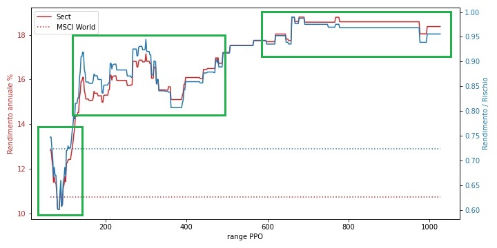
About the risk, rather than showing the standard deviation of returns as a measure, I prefer to report the Return / Risk ratio (blue line in Figure 1), because it has a trend that for the most part overlap the return. We can explain that as the return increases, the risk grows with a lower intensity, therefore seeking the higher return does not lead to out-of-control risks.
How is comparison with MSCI World Index, its benchmark? The dashed red and blue lines indicate respectively the return and the risk / return ratio for the MSCI World Index over the same time period chosen for “Sector”. The success of “Sector” is clear, with an x range value above 150, it always is able to beat the market.
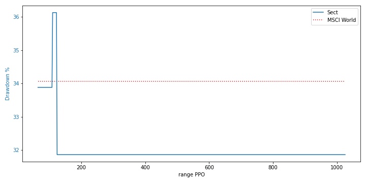
The trend of the maximum drawdown depending on the value of x is relatively stable, after a peak at 36% shortly after the value x = 100, it stops just below 32%. For a rotational system this behavior is not anomalous, it can be explained that when the maximum drawdown occurs, most of the value x choose the same ETF and therefore will they follow the same trend. The dotted line are related to the maximum drawdown for MSCI World, which is slightly above “Sector”.
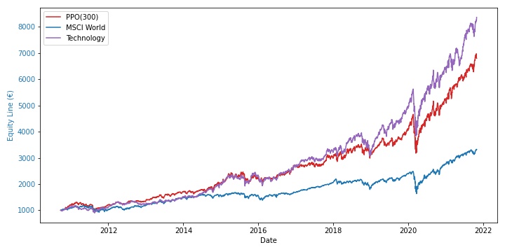
If we stop our analysis here, the best performance for “Sector” obtained from time series simulations, is the one with a value x of 300 days. Its equity line has an interesting trend, since 2010 it has been often above MSCI World and it has increased the gap year after year, reaching an average yearly logarithmic return of about 15%, compared to 11% for MSCI World (figure 3).
If we want to choose a champion for benchmarks, any trading system would be defeated by the competition with MSCI World Information Technology, a real heavyweight among stock indices! Even “Sector” is not excluded from this fate, it can keep pace until 2017 and then it lose ground in the subsequent years.
Assets and number of blades
A rotational system must not choose only one asset at a time but rather it can also take two or more assets, potentially this number can vary over time under the action of a filter. Let’s try to change the number of ETFs held in the portfolio simultaneously by “Sector” from 1 to 5, in addition to change the interval x from 64 to 512 days, then we observe the results in figure 4.
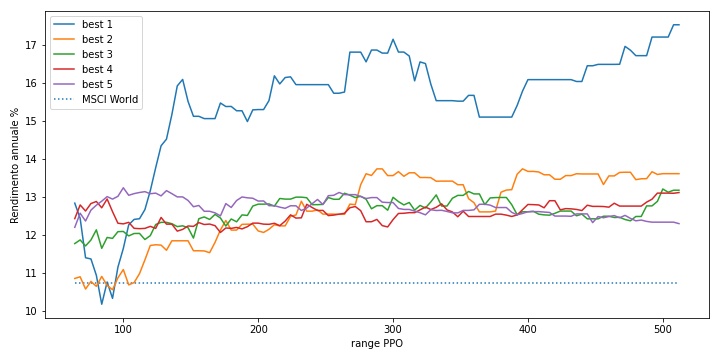
The similarity between the rotary wing and the trading system can help us to better understand this result. During the preliminary design of a helicopter, to set the number of blades needs to imprint well define features to the helicopter. In general terms, if you have exuberant engines, to take advantage of all the cavalry available, it is recommended to have many blades, usually 4 or 5, which allow you to transmit all the power in the air and to guarantee excellent performance to our helicopter. On the other hand, if the powerplant is small and it have not a lot of power, a reduced number of blades allows for greater efficiency, especially at low speeds.
The number of blades is similar to the number of assets used by the rotational system: if the basket of our assets has many stocks with “exuberant” returns, a high number of stocks held simultaneously by the rotational system allows us to take advantage of these returns, but if the basket has few assets that stand out from the average, a small number leads to a better efficiency.
If “Sector” performs best with only one ETF at a time, it means that MSCI World provides the best returns with one sector at a time, so we only need to select a single sector to take advantage of this single source of extra return.
On the risk front, we can see in figures 5 and 6 the trends of the Return / Risk Ratio and of the Maximum DrawDown respectively. With more than one ETF at a time, we have a reduction in risk, but at the cost of a lower return.
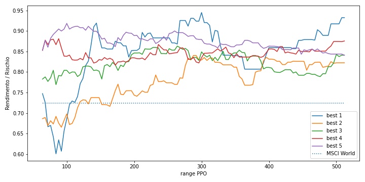
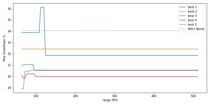
Usually a dual axis graph is not able to best express a function with two or more parameters. Figures 4, 5 and 6 have many lines that intersect each other and everything can be difficult to interpret. A surface chart, on the other hand, gives a better idea. In figure 7 we see the 3D transposition of figure 4, where the 2 axes at the base report the PPO(x) and the number of ETFs, while the vertical axis indicates the average annual return.
This surface looks like a framework of a mountain landscape, with peaks on the left side and a large plateau at its foot. This trend shows how choosing only one ETF puts us on top of the mountains, peaking around x = 300, while choosing two or more ETFs leads to the plateau of returns.

Robustness
Along the path of choosing the parameters for our trading system, we may run into a particular combination of these parameters that hide a dangerous pitfall. If we calculate our metrics such as yield and volatility over the entire time span of the time series, we can find interesting results, but after a more careful analysis we can find that our parameters work perfectly only in a given year while in all other years, results are poor – the overall result is strongly influenced by that single lucky year. In worst cases, our parameters are like a tailored dress, worn perfectly by one particular time series and badly by all the others.
This behavior is expressed in one word: overfitting. Every analyst fears this term, which indicates an excessive fix of our parameters to a given block of data. Who has ever noticed the huge difference between those studying by heart and those studying the method? The former fail to go beyond a specific school question, the latter remember the subject learned for years. After all, this is also an example of overfitting!
This pitfall is always around the corner and is a problem well known to quantitative analysts and it requires a validation process, such as with Out-of-Sample and In-Sample sampling, or with more refined methods such as Walk Forward Analysis. I personally prefer a more practical method, in the development and validation of a trading system I divide the available time series into several parts and I test the strategy separately in these partitions. The objective of this method is to isolate any time periods that have led to results far from the average.
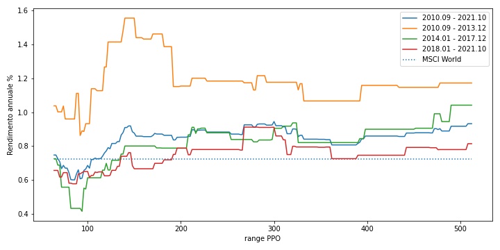
In figure 8 we see the robustness analysis conducted on “Sector”. The time series was split into three partitions of approximately three years each and then the return / risk ratio was calculated on each of them depending on the value of x. The yellow line, the one relating to the three-year period 2010-2013, achieved brilliant results compared to the other two partitions. If we believe in the yellow line, the best results is with PPO(150), but overfitting is hide and the parameter x = 150 certainly does not shine in the green and red partitions. A better fate for x = 300, chosen in the previous paragraphs, which is confirmed among the best parameters in every partitions.
Timeframe and rotation speed
Among the various questions and requests received regarding “Sector”, the one that generated the most interest on my own is how the strategy responds if we increase the portfolio rotation frequency, for example from monthly to biweekly. In figure 9 we can see the result, where there is a marked degradation of the results.
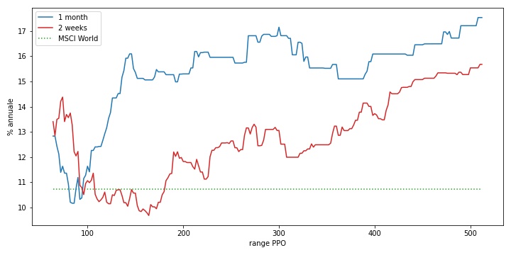
However, we note how for values around PPO(50) we have a relative maximum for the bi-weekly strategy (red line), therefore high rotation frequency and a narrow x interval match each other well, seizing the opportunities offered by the market in the medium period.
Even in this case I found a similarity with the helicopter – the rotation frequency of the strategy reminds me the rotor rotation speed, because high rotations allow for good reactivity and rapid attitude changes. Furthermore, as the increase in the rotation rate of the strategy is followed by smaller intervals for the indicators and oscillators, so the rotor rotation speed matches well with small diameters: the radio-controlled helicopters are a good example, the extreme low diameter of the rotor goes well with very high rotation speeds, which can reach up to 3000 revolutions per minute, against about 300 revolutions of the larger “cousins”.
Filter and autopilot
The autopilot is an electro-mechanical device born in the aeronautical field and today widely used in all means of transport. Its primary function is to unload pilot’s work, replacing him in all those situations that can be highly repetitive or that would require constant concentration, such as maintaining speed, course and altitude. Let’s try to imagine if during a flight a sudden perturbation would change the attitude of our aircraft, if the pilot is not ready to act on the controls the effects on the flight will be very large.
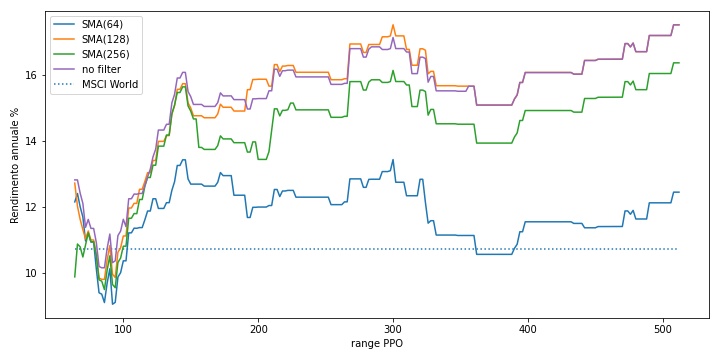
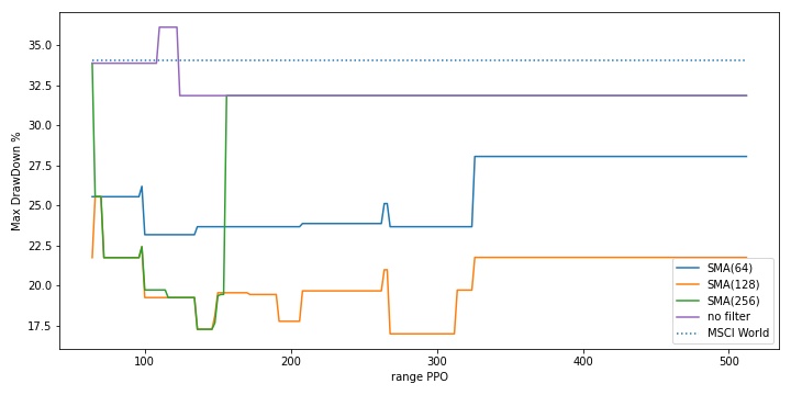
An unfiltered strategy is like an aircraft without an autopilot, when volatility raises on the financial markets it can lead to a drastic reduction in returns if no action is immediately taken. In figure 10 we see what is the effect of inserting an autopilot at “Sector”, trying 3 simple moving average (SMA) filters, with intervals of 64, 128 and 256 days (figures 10 and 11).
A filter with SMA(128) provides excellent results, in practice no return is lost and the maximum drawdown is halved, approximately around 20%, which is a good value for an equity strategy.
Which parameters to choose
Now, we recap what we has written previously, the best results are found with the following parameters:
- PPO(300)
- rotation on a single asset class
- filter SMA(128)
Why then did I choose PPO(384) and without filter? The parameters must also take into account more operational issues and sometimes even emotional ones. An interesting detail, that we have overlooked in this analysis, is the impact of costs and taxes at every time of ETF rotation: if we have a low x, the rotations will be more frequent, with a greater incidence of costs which reduces the capital to reinvest; if x is high, the rotations are smaller and the capital is invested for long time. If x = 300 maximizes the return, x = 384 instead significantly reduces portfolio rotation, that remains within the optimal area marked by the central green rectangle of Figure 1.
We could include the impact of costs and taxes in our simulations, but I believe that these questions differ greatly from one investor to another, for instance every broker has its own commission plans and whether the tax payment from the country we are living. Personally, I use an approach that forecast at the beginning of the year how much taxes I should pay during the year and then I block some cash in my bank account, so that when I have a portfolio rotation I can reinvest all the capital without having to subtract every time the related costs.
About the simple moving average filter, I choice not to adopt it, in order to always remain on the market to collect all the opportunities. If SMA(128) gives excellent results, we can’t say the same for its “neighbors” SMA(64), that sees a substantial decline in its return, and SMA(256), which has the same maximum drawdown like the version without filter. This results state a low data robustness and it does not give any confidence that SMA(128) will not incur in poor return in the future. Remind that the goal of “Sector” is to maximize returns and that it is ideally placed as a satellite in a portfolio with a relatively low percentage weight, we can accept to have large movement on the drawdown in exchange for a higher expected return.
Conclusions
After this study through the similarity with the world of the rotary wing, the question I would ideally ask is “if the Sector portfolio were a helicopter, what model would it be?” I think I have no doubt, surely an Agusta AB-212 like the one in figure 12, equipped with a substantially simple rotor, formed by only two blades and with a wide diameter, the same way as “Sector” is equipped with a PPO with a large range and the use of only one asset at a time. The “212” and “Sector” are both small in size, they grant a great variety of roles, robust and consistent enough for use in any scenario that arises.

If you are interested in learning about the world of the rotary wing, I can recommend the first chapter of a text published by the Federal Aviation Administration of the USA, Helicopter Flying Handbook – Chapter 1, an excellent introduction that is aimed at a non-specialist audience. If you want to follow the adventures of the most famous helicopter of the moment, take a look at the website Ingenuity, NASA’s Martian helicopter.
Happy trading and happy landing!
If you have any questions to ask me, do not hesitate to write to me in the form below, otherwise you can find me on Facebook and LinkedIn. If you want to stay up-to-date and not miss any article as soon as it comes out, subscribe to the newsletter by filling out the following form:
If you like my articles and MP Investit project, you can support me with a free donation with PayPal or with a Brave browser reward. This encourage me to produce better and better content. Thank you!