

(Feature photo by Johannes Plenio from Pexels)
When I made the significant leap of living on my own, a fixed ritual dominated my Saturday mornings: grocery shopping. I’ve never harbored a particular passion for this activity; for me, wandering around a supermarket is more of a necessity than a pleasure. My strategy was simple and direct: enter, put what I needed into the cart, pay, and leave. In this task, maximizing efficiency translated to minimizing time lost wandering among the endless aisles, searching for the items on my list. And this is where the ingenious work of the salespeople comes into play.
The shelves transform into an artwork resembling a mosaic, composed of many small products seemingly arranged at random. Frozen products find their place within refrigerated units, the bread corner hosts all oven products, beverages are placed near the checkout, and so on. The salespeople, skilled mosaicists, arrange all the products daily with a predetermined order that adheres to precise rules, enhancing their customers’ shopping experience. The intricate mosaic starts with collecting homogeneous products, then aligns various groups with affinities, and continues by creating thematic sections.

This meticulous assembly, starting from individual elements and escalating, is a symphony of rationality that efficiently manages thousands of products. The advantages are manifold: for us customers, it means a quick and precise search for desired products, while the supermarket optimizes its resources. For instance, it’s preferable to have a single vast refrigerated counter housing all items requiring low temperatures, rather than dispersing energies across numerous scattered fridges. Additionally, the staff can specialize, allowing those focusing on, say, meat to have adjacent shelves in their workspace.
Whether frozen products or a complex database, the principle of hierarchical grouping finds universal application in the art of dividing and organizing. In the financial world, the problem of classifying instruments is crucial, and solutions are constantly evolving. Financial products are numerous and can vary widely, considering the various types of certificates. Customarily, we begin by grouping them into investment classes, distinguishing stocks from bonds, commodities, and liquidity. Within each class, we further differentiate products based on geographical area, volatility level, reference currency, and so on, much like a skilled artist selecting and skillfully positioning each mosaic tile.
Categorizing financial instruments stems not only from the need to navigate among them but also from the quest to create a product portfolio that best represents financial markets. It’s akin to our supermarket adventure: we don’t settle for just one section, filling our cart exclusively with water bottles or crates of fruit; instead, we move adeptly across shelves, carefully selecting products from various sections. Thus, our cart fills with a basket representing the entire supermarket.
The skill in aggregating financial instruments and, in turn, hierarchically organizing these aggregations, is a noteworthy ability. While it’s an achievable feat when maintaining a high-level view, merely distinguishing between stocks, bonds, and commodities, the game becomes more complex when increasing the number of categories and their depth. In this context, difficulties multiply, and choices often become nearly arbitrary. Today’s classification of financial instruments is primarily dictated by habits and sometimes biases: is it truly right to group a protected capital certificate with a leverage certificate just because they share a similar legal structure? Perhaps it would be more appropriate to associate the former with bonds. Yet, there’s no absolute answer; no mistake is made in either scenario.
GICS, Demand-Oriented Classification
In the financial world, industrial taxonomy represents the discipline of hierarchically classifying companies, a fundamental concept for creating stock indices. Among the most relevant, the Industry Classification Benchmark (ICB) and the Global Industry Classification Standard (GICS) emerge, respectively employed by Stoxx and FTSE, and by MSCI and S&P Dow Jones. The subdivision of companies into sectors and groups forms the basis of many investment decisions following this schema, and evaluations of each stock are primarily assessed within these categories.
Let’s specifically examine the GICS classification, perhaps the most widespread and globally recognized. Developed by MSCI in 1999, GICS comprises 11 sectors, listed at the top of figure 2, which unfolds in a hierarchical structure spanning 4 levels.

Classifying companies is not a simple task, as it requires evaluating a series of factors to determine a categorization that accurately reflects the business model. There are several methodologies to develop an industrial taxonomy. For instance, one of the classical methods distinguishes between goods-producing industries (secondary sector) and service-oriented companies (tertiary sector). However, the current landscape sees numerous companies offering both goods and services, blurring the boundary between sectors. In this framework, GICS was designed to overcome this challenge, orienting instead based on market demand. For example, sectors like “Consumer Discretionary” and “Consumer Staples” collectively encompass subcategories of goods and services.
In figure 3, we can observe an example of the “Information Technology” sector, encompassing all companies operating in the IT sector. The hierarchical structure divides these companies into 3 groups, one related to service companies and two related to industries. Subsequently, a further hierarchical subdivision refines the companies based on the type of product and/or service.

The demand-oriented approach of GICS enjoys broad consensus and is used in creating sectoral and thematic indices. However, even this methodology is not immune to limitations, as there will always be companies that evade classification. A paradigmatic example is Amazon.com, a company offering highly diversified goods and services: from online retail to logistics and even cloud services. This approach highlights the complexity of the corporate world and the need to resort to empirical, if not arbitrary, rules to solve these financial puzzles.
Diametrically opposite, we find the purely statistical approach, solely based on historical series data and leveraging past returns. Classification occurs based on correlation, often generating less intuitive groups that differ between countries and regions but exhibit very similar price trends. This is the approach we aim to explore in detail in this article, using machine learning algorithms (for those preferring the English terminology). This approach aligns more closely with the needs of those aiming to construct a well-balanced portfolio.
Hierarchical Clustering
Let’s begin by imagining a Cartesian plane with a series of points distributed within it. For simplicity, let’s consider the Cartesian axes representing the width and depth of this plane, so that each of the ten points under examination has its own coordinates. At a glance, we can notice that these ten points can be divided into two distinct groups: one that includes points from 1 to 5 (occupying the lower-left area of the graph) and a second one involving points from 6 to 10 (located in the upper-right area). This scenario represents an ideal case where it’s still possible to manually divide the groups, considering the few points distributed on a plane. However, challenges escalate rapidly as the number of points and dimensions involved increase, akin to a puzzle growing more complex with the increase in pieces and their arrangement.

The Theory of Hierarchical Clustering offers an algorithm to aggregate points and construct a hierarchical structure similar to the one illustrated in Figure 2. The process occurs from bottom to top, following these steps:
- Initially, each point is treated as a separate group. In our example, the ten points are considered as ten distinct groups.
- The two closest points or groups are then merged to form a new group. As depicted in the top-right image of Figure 5, our points 2 and 3 represent the closest pair and are collected into a new group highlighted with an orange rectangle, reducing the total to 9 point groups.
- The process continues by identifying the next closest points or groups, which are also aggregated to form new groups. Figure 5 illustrates this process: in the second image (top-right), points 7 and 8 are united into a new group; in the third image (bottom-left), point 1 joins the group formed by 2 and 3; in the fourth figure (bottom-right), points 4 and 5 form a new group, reducing the number of groups to 6.
- The aggregation process continues until the desired number of groups is reached.
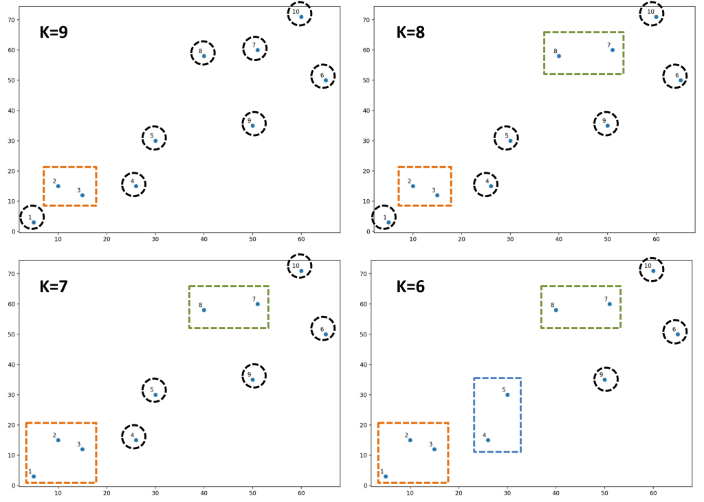
Figure 6 represents the result of hierarchical clustering when proceeding to obtain only two groups, indicated by rectangles with solid lines. If the aggregation process is halted earlier, perhaps identifying four groups, a division among the points will be obtained as highlighted by rectangles with dashed lines. Like an evolving mosaic, this sequence of steps makes visible the hidden hierarchical structure among the data, where the four groups highlighted by dashed rectangles are encompassed within the pair of continuous-line rectangles.

The representation on a Cartesian plane, though useful, has its limits because different levels of grouping overlap, complicating the interpretation of the graph. Alternatively, the Theory of Hierarchical Clustering employs an even more effective graphical method: the dendrogram.

Figure 7 illustrates the dendrogram created based on our ten example points. Its construction process is surprisingly simple and mirrors the same phases of the hierarchical clustering algorithm:
- We begin by identifying the closest points or groups. In our case, points 2 and 3 form the closest pair, which we connect with a horizontal line placed at a height corresponding to their distance.
- We proceed by identifying the next closest points or groups, connecting them through horizontal and vertical lines. The height of the vertical lines always reflects the relative distance between them.
- This process cyclically repeats until all groups are united under a single group.
Constructed in this manner, the dendrogram resembles a stylized tree: it’s no coincidence that “dendrogram” is a term of Latin origin translating to “tree-like lines”. Starting from the top and progressing downwards, the lines branch out, creating new branches until reaching the base where the points are comparable to the leaves of the tree. The dendrogram proves ideal for visualizing the history of groupings and for easily identifying the optimal number of groups. In our example, it can be observed that the ideal number of groups is 2 because they exhibit the greatest relative distance among all groups (blue vertical lines).
For those interested in creating the dendrogram using the Python programming language, here’s the code I used:
# Import libraries
import numpy as np
import matplotlib.pyplot as plt
from scipy.cluster.hierarchy import dendrogram, linkage

# Define coordinates of the points
X = np.array([[ 5, 3], [10,15], [15,12], [26,15], [30,30],
              [65,50], [51,60], [40,58], [50,35], [60,71] ])

# Represent points in the Cartesian plane
plt.figure( figsize = (10,7) )
plt.subplots_adjust(bottom = .1)
plt.scatter( X[:,0],X[:,1], label = 'True Position')

labels = range(1,11)
for label, x, y in zip(labels, X[:,0],X[:,1]) :
    plt.annotate(label,
                 xy = (x,y),
                 xytext = (-3,3),
                 textcoords = 'offset points',
                 ha = 'right',
                 va = 'bottom')
plt.savefig('scatter.jpg', dpi = 200)
plt.show()

# Create the Dendrogram
linked = linkage( X,
                 method = 'ward',
                 metric = "euclidean")
labelList = range(1,11)
plt.figure( figsize = (10,7) )
dendrogram(linked,
          orientation = 'top',
          labels = labelList,
          distance_sort = 'descending',
          show_leaf_counts = True)
plt.savefig('dendrogram.jpg', dpi = 200)
plt.show()
The hierarchical clustering algorithm requires specifying two fundamental elements: the metric used to calculate distances between points and the criterion for connecting groups. In our approach, we selected the Euclidean distance, known for its representation via a continuous line connecting points, and the “Ward” criterion. The latter calculates the distance between groups through the sum of the squares of distances of the points within each grouping. These parameters represent common choices in the context of the dendrogram and contribute to outlining the connectivity path between the points.
Hierarchical Clustering in Finance
Before delving into a practical application in the investment world, we must determine how to measure distances between different financial instruments. In the previous example of the ten points, we used Cartesian coordinates and Euclidean distance. However, in a financial context, what approach can we adopt? How can we establish whether two companies are close or distant from each other? Intuition might suggest using returns and volatility calculated from historical price series, as these measures are often plotted along the axes of a Cartesian plane. Unfortunately, we cannot choose this solution because these measures do not satisfy the properties of metric spaces.
I don’t want to delve too deeply into mathematical concepts that might steer us away from our main goal, but we can recall that a metric space is a set of elements associated with a distance function, denoted as a metric, d. In our example, the elements are points in the Cartesian plane (as illustrated in Figure 4), while the metric is the Euclidean distance, which utilizes the Pythagorean theorem to calculate distances between points.
For a space to qualify as metric, it must satisfy the following fundamental requirements:
- d(x,y) > 0 (the distance measure can never be negative)
- If x = y, then d(x,y) = 0 (coinciding elements have zero distance)
- d(x,y) = d(y,x) (principle of symmetry)
- d(x,y) ≤ d(x,z) + d(z,y) (the direct path between two points is always shorter or equal to the path passing through a third point)
In this context, it’s interesting to note how returns and volatility satisfy the first two requirements, as they are positive measures, and for identical values, the distance will be zero. However, they do not adhere to the third and fourth requirements, which demand symmetry in distance measures and the sub-additivity property, respectively. Hence, we cannot directly employ returns and volatility as metrics to evaluate the distance between companies. This limitation leads us to explore other measures that can be adopted to assess the distance between stocks.
Correlation is an excellent coefficient to evaluate how similar two historical price series are, potentially making it a valid metric. However, it doesn’t satisfy all the requirements of metric spaces. For instance, correlation can assume negative values and sometimes provide inconsistent measures, such as the difference between correlations 0.9 and 1.0 being the same as the difference between 0.1 and 0.2, despite the former representing a greater difference in terms of association.
Through suitable manipulations, it’s possible to define a distance between historical price series using correlation. Suppose we have a basket of N historical price series and have computed the correlation matrix. In this context, we can define the distance matrix between historical price series in two phases:
 \tag{1}
D_{ij}=
\sqrt{\frac{1}{2}(1-\rho_{i,j})}
This is called the correlation-distance matrix. It’s a transformation of correlation that complies with the requirements of a metric space.
 \tag{2}
d_{ij}=
\sqrt{
\sum_{\substack{k=1}}^n
(D_{ik}-D_{kj})^2
}
This is called the augmented distance matrix. This measure indicates how similar the basket of historical series considers the two series i and j, considering the entire set.
Unlike correlation, which assesses how two historical series are “close” to each other, the measure dij reflects how “close” the set of historical series considers the series i and j. This difference in approach produces more coherent measurements and more interesting results, opening new avenues of understanding in the landscape of historical price series.
FTSE MIB
Finally, we arrive at a practical application in the world of investments of this fascinating theory of hierarchical clustering. In particular, we consider the stocks currently composing the FTSE MIB index and proceed with a statistical classification.
Figure 8 reveals the dendrogram applied to the FTSE MIB, unveiling all its fascinating beauty. To create this image, we took the time series of the 40 companies constituting our index. Through the calculation of the correlation matrix and the processing of the augmented distance matrix, the hierarchical clustering algorithm has generated a magnificent dendrogram.

In our dendrogram, eight highlighted colored rectangles were added to emphasize the main groups. The choice to identify eight groups is arbitrary; we could have chosen more or fewer. At the ends of the tree, two titles stand out: Diasorin on the left and Saipem on the right. In statistical terms, these are known as “outliers,” a term used to denote values significantly distant from other observations. These do not represent errors: the algorithm has detected that the price trends of these two companies are markedly different from the others. For example, Saipem has experienced a drastic drop in quotations in recent years, making it unique compared to others.
Now, let’s explore in detail the eight groups, from left to right:
- Health Group: This group consists of Recordati, Campari, and Amplifon. It’s surprising to see Campari in this group, although its business sector is not directly related. However, the price trends of the three companies are remarkably similar. It’s not coincidental that Diasorin is adjacent to this group, as it also operates in the health sector.
- Mixed Group: This group includes Inwit and ERG. It could be termed as a buffer group, with two companies whose price trends are very similar to each other.
- Utility Group: Comprised of Hera, ENEL, A2A, Italgas, Snam, and Terna. The algorithm effectively grouped companies from the same sector, that of utilities.
- Automotive Group: This group includes Interpump Group, CNH, Iveco, Stellantis, and Pirelli. Again, we find stocks related to the same sector here.
- Growth Group: This group consists of Prysmian, Ferrari, Moncler, Nexi, and STM. It’s an intriguing group as these companies operate in different sectors but have been grouped based on strong growth seen in recent years.
- Financial Services Group: It includes Unipol, Poste, Mediolanum, Azimut, Banca Generali, and Fineco. There are no surprises here, as these stocks belong to the same sector and share similar stock market price trends.
- Banks Group: Comprised of Mediobanca, Generali, Intesa, Unicredit, BPM, and BPER. Here, we find Italy’s major banking groups, characterized by a strong correlation.
- Multinational Group: Includes Leonardo, TIM, ENI, and Tenaris. Despite diverse business activities, these companies share a strong international presence.
The detailed overview of these groups displayed by the dendrogram offers a fascinating perspective on the hidden connections between different companies in the FTSE MIB. What we have examined clearly demonstrates the effectiveness of the hierarchical clustering algorithm in ‘reading’ price dynamics and associating different companies based on its own criteria.
In the FTSE MIB example, one grouping criterion is the companies’ belongingness to the same sector, as highlighted by the banking group, while in other cases, the criterion is more transversal and based on past results, as shown by the group we named “growth”. Furthermore, the arrangement of the groups within the dendrogram is not random: similar groups are placed close to each other, for instance, the banking group is located between the financial services and multinational groups, creating a structure that reflects relationships and similarities between the companies.
Conclusion
The dendrogram obtained for the FTSE MIB represents a clear example of the power and intrinsic beauty in machine learning algorithms. These algorithms can give a natural order to numerical data without being influenced by preconceptions or predefined patterns.
The hierarchical clustering algorithm has shown remarkable ability in recognizing exceptions and peculiarities in financial data, providing an important lesson on the power of data analysis and machine learning algorithms in the financial world, revealing the deep connection between data and investment decisions.
Through the exploration of the classification of companies within the FTSE MIB, we have delved into how it’s possible to identify significant structures and connections. This approach has allowed for a clear and intuitive visualization of how companies group within the index, offering new perspectives for portfolio analysis and management.
Reflecting on the obtained results, it’s evident that the use of machine learning algorithms, such as hierarchical clustering, represents a valuable ally for financial professionals dealing with the ever-evolving challenges of the investment world.
In our next article, we will further delve into this topic and explore how it’s possible to develop investment strategies based on these analyses.
Happy clustering!
If you have any questions to ask me, do not hesitate to write to me in the form below, otherwise you can find me on Facebook and LinkedIn. If you want to stay up-to-date and not miss any article as soon as it comes out, subscribe to the newsletter by filling out the following form:
If you like my articles and MP Investit project, you can support me with a free donation with PayPal. This encourage me to produce better and better content. Thank you!